
- 172
- 4 448 940
Tim Mcburnie - The Drawing Codex
Приєднався 29 жов 2012
How I Finally Decided Between Painted vs ComicBook Style.
Check out my Free Line and Color Quick Start Guide: www.thedrawingcodex.com/quickstart You will learn how to develop a simple reliable process in photoshop. You also get all the brushes and PSDs that I use in the guide (the same ones I use for most of my illustrations).
Lets discuss Art Style!
In the beginning, even though I had a style... I didn't really know how it worked.
When I got feedback it was hard to know how to apply some of the things people were suggesting.
Often when I needed to increase contrast or impact or to make the image feel a different way... the road forward is unclear.
I think understanding how Style and Lighting interact, especially when it comes to rendering form vs leaving things less rendered (and thus focusing on shape) is a key component of Style.
It took me a long time to figure this stuff out. This video talks about my journey and struggles to get better and understand how my style really worked.
Here are some Automagically generated takeaways to help with search optimisation:
----
Early on. I was torn between painted realistic styles, and cartoony comic book styles I wasn't sure if I wanted to make things realistic or exaggerated.
A major part of this was not understanding how to leverage form versus shape. I wasn’t ever really shot how to get the looks I wanted, and I didn’t know how the style I had chosen really worked.
The concepts of painted style, comic book style, realism, and 'cartooniness' are often intermingled. But there are key differences in the way we represent the world which can drastically effect how our art looks. Often these are less about realism or ‘rendering’ and more to do with how we think about how lighting effects our art… be it in film, or comics, or video games.
Also… in the beginning, our style is often limited by our technical ability. We often choose a style based on what seems easy or achievable at the moment. There's also a tendency to value certain styles more because they appear more technically challenging. I used to think a rendered or painted style was better and more valuable.
One concept that helped me understand these different elements of style is form versus shape. In this video, I share my journey of mastering different aspects of creating images in comics, illustration, and concept art. By sharing my journey, I hope you can understand how these concepts might apply to your style.
KEY TAKEAWAY POINTS
1. FORM VS SHAPE
- Form focuses on structure, anatomy, and three-dimensional aspects defined by lighting.
- Shape is more iconographic and symbolic, simplifying objects into recognizable icons.
2. IMPACT OF TECHNICAL ABILITY
- Initial style choices are often limited by technical skills.
- We tend to value styles that seem more technically challenging.
3. UNDERSTANDING FORM & SHAPE GIVES YOU FREEDOM
- Figuring out how to get the look you want is easier if you can tease out these different elements of style.
- More technical ability will also give you more options when it comes to expressing yourself.
----
00:00 Intro
02:41 Welcome
03:24 Basic Concept of Form Vs Shape
06:08 Early on...
13:49 Problems With Not Having Style Sorted!
16:04 Progression And Combining Painted Styles With Comicbook Styles
18:21 Better Technical Foundation Can Influence Style
27:39 Going Back To Shape Focused Designs
30:35 Clean Line Style (Focusing on Flat Color Design in Comics)
32:49 Advantages of Cartoony Styles
34:10 Final Thoughts!
37:03 Out!
Happy Drawing!
Tim Mcburnie
Learn Drawing and Illustration from me: www.thedrawingcodex.com
Portfolio: www.timmcburnie.com
www.artstation.com/tim-mcburnie
timmcburnie
timmcburnie
Переглядів: 18 488
Відео


Does Your Art Style Properly Emphasise Form… or Shape?
Переглядів 6 тис.День тому
Check out my Free Illustration Mini Workshop where I share my journey from Amateur to Pro: www.thedrawingcodex.com/illustrationworkshop You will get some simple advice on how to get more detail and polish in your work. How to think about composition. And my thoughts on how to prepare for professional work. This is an idea that crosses all forms of Art, Illustration, Cinema, Animation, Video Gam...
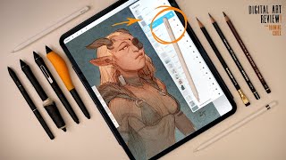
Apple Pencil Pro... Pro Artist Review: A Tech-Bump Hellscape.
Переглядів 13 тис.21 день тому
Check out my Free Illustration Mini Workshop where I share my journey from Amateur to Pro: www.thedrawingcodex.com/illustrationworkshop You will get some simple advice on how to get more detail and polish in your work. How to think about composition. And my thoughts on how to prepare for professional work. Let's take a deeper look at the new Apple Pencil Pro. And how this new tool bodes for App...

Color vs Tonal Contrast: How Does This Define You Style...?
Переглядів 7 тис.21 день тому
Check out my Free Illustration Mini Workshop where I share my journey from Amateur to Pro: www.thedrawingcodex.com/illustrationworkshop You will get some simple advice on how to get more detail and polish in your work. How to think about composition. And my thoughts on how to prepare for professional work. Let's look at how successful artists use Tonal Vs Color Contrast to help make great image...

Will This iPad Help You Make Better Art?
Переглядів 35 тис.Місяць тому
Check out my Free Illustration Mini Workshop where I share my journey from Amateur to Pro: www.thedrawingcodex.com/illustrationworkshop You will get some simple advice on how to get more detail and polish in your work. How to think about composition. And my thoughts on how to prepare for professional work. Let's take a first look at the 13" M4 iPad Pro with it's accompanying "Pencil Pro" This i...

Learning To Draw Akuma! (Clip Studio + Samsung S9 Ultra)
Переглядів 23 тис.Місяць тому
Check out my Free Line and Color Quick Start Guide: www.thedrawingcodex.com/quickstart You will learn how to develop a simple reliable process in photoshop. You also get all the brushes and PSDs that I use in the guide (the same ones I use for most of my illustrations). Level up your anatomy and structural drawing! In this video I draw Akuma from Street Fighter. The focus here is on breaking do...
Mastering Color Contrast Upgraded My Art Style!
Переглядів 4,5 тис.Місяць тому
Check out my Free Line and Color Quick Start Guide: www.thedrawingcodex.com/quickstart You will learn how to develop a simple reliable process in photoshop. You also get all the brushes and PSDs that I use in the guide (the same ones I use for most of my illustrations). Here are some Automagically generated takeaways to help with search optimisation: Knowing how to infuse your art, illustration...
Give Your Art Impact...Understand Tonal Contrast Vs Color Contrast
Переглядів 5 тис.Місяць тому
Check out my Free Illustration Mini Workshop where I share my journey from Amateur to Pro: www.thedrawingcodex.com/illustrationworkshop You will get some simple advice on how to get more detail and polish in your work. How to think about composition. And my thoughts on how to prepare for professional work. Let's talk about an important and often overlooked aspect of Illustration and Image Makin...

Art Ritual 20: Fairy Queen (Real Time Tutorial In Procreate)
Переглядів 18 тис.Місяць тому
Line and Color Quick Start Guide: www.thedrawingcodex.com/quickstart Real time Fully Narrated Draw With Me Session! A big part of the art journey is figuring out how you apply these concepts into your own work and style! If you want to learn about the drawing techniques I am using based on the Loomis Method you can check out these videos: Building The Figure - ua-cam.com/video/wCrGfGZhLWU/v-deo...
Warm Vs Cool Rules: Do Great Artists Actually Follow Them?
Переглядів 7 тис.2 місяці тому
Check out my Free Illustration Mini Workshop where I share my journey from Amateur to Pro: www.thedrawingcodex.com/illustrationworkshop You will get some simple advice on how to get more detail and polish in your work. How to think about composition. And my thoughts on how to prepare for professional work. Let's look at how successful artists use Warm and Cool color theory to help make great im...
How I Escaped The Low Contrast Muddy Color Trap
Переглядів 14 тис.2 місяці тому
Check out my Free Illustration Mini Workshop where I share my journey from Amateur to Pro: www.thedrawingcodex.com/illustrationworkshop You will get some simple advice on how to get more detail and polish in your work. How to think about composition. And my thoughts on how to prepare for professional work. Let's talk about the way Warm and Cool Colors can be used in your art! More specifically ...
Forget Complex Color Theory... This Is All You Need!
Переглядів 33 тис.2 місяці тому
Check out my Free Illustration Mini Workshop where I share my journey from Amateur to Pro: www.thedrawingcodex.com/illustrationworkshop You will get some simple advice on how to get more detail and polish in your work. How to think about composition. And my thoughts on how to prepare for professional work. Let's talk about the way Warm and Cool Colors can be used in your art! This video turned ...
Professional Line & Color Process: Cover Illustration Tutorial P4
Переглядів 4,4 тис.2 місяці тому
Check out my Free Line and Color Quick Start Guide: www.thedrawingcodex.com/quickstart You will learn how to develop a simple reliable process in photoshop. You also get all the brushes and PSDs that I use in the guide (the same ones I use for most of my illustrations). Let's do the final stage of our cover style illustration... The Color! I spend a fair bit of time in the beginning going over ...
Get Emotion And Structure In Your Linework: Cover Illustration Tutorial P3
Переглядів 3,1 тис.2 місяці тому
Check out my Free Line and Color Quick Start Guide: www.thedrawingcodex.com/quickstart You will learn how to develop a simple reliable process in photoshop. You also get all the brushes and PSDs that I use in the guide (the same ones I use for most of my illustrations). Inking? Digital Inking?.... Let's look at how to create some final polished lines based on our previous construction drawing! ...
Properly Construct Your Drawing: Cover Illustration Tutorial P2
Переглядів 13 тис.3 місяці тому
Check out my Free Line and Color Quick Start Guide: www.thedrawingcodex.com/quickstart You will learn how to develop a simple reliable process in photoshop. You also get all the brushes and PSDs that I use in the guide (the same ones I use for most of my illustrations). Let's look at how to expand and enhance the 'Construction Phase' of our Illustration. Focusing on structure and solid drawing....
Nail Your Colour Scheme... With Thumbnails: Cover Illustration Tutorial P1
Переглядів 7 тис.3 місяці тому
Nail Your Colour Scheme... With Thumbnails: Cover Illustration Tutorial P1
The Simple Color Schemes Pro Artists Use: (Try Them)
Переглядів 23 тис.3 місяці тому
The Simple Color Schemes Pro Artists Use: (Try Them)
Cover Illustration: How To Choose Your Color Scheme
Переглядів 21 тис.3 місяці тому
Cover Illustration: How To Choose Your Color Scheme
This Simple Color Theory Always Works
Переглядів 188 тис.4 місяці тому
This Simple Color Theory Always Works
Frank Frazetta Illustration Process (What Can We Learn?)
Переглядів 19 тис.4 місяці тому
Frank Frazetta Illustration Process (What Can We Learn?)
How Detailed Should Your Thumbnails Be???
Переглядів 8 тис.4 місяці тому
How Detailed Should Your Thumbnails Be???
Art Ritual 19: Tree Goblin (Hang Out and Draw!)
Переглядів 11 тис.4 місяці тому
Art Ritual 19: Tree Goblin (Hang Out and Draw!)
Keyframe Illustration: These Work When You Run Out Of Ideas...
Переглядів 93 тис.5 місяців тому
Keyframe Illustration: These Work When You Run Out Of Ideas...
Keyframe Illustration Ideas: Push Past "Generic"
Переглядів 122 тис.5 місяців тому
Keyframe Illustration Ideas: Push Past "Generic"
How Do You Actually Start An Illustration? (3 Ways That Work)
Переглядів 19 тис.6 місяців тому
How Do You Actually Start An Illustration? (3 Ways That Work)
Vintage Poster Design Master: Noriyoshi Ohrai!
Переглядів 3,1 тис.6 місяців тому
Vintage Poster Design Master: Noriyoshi Ohrai!
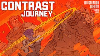
Win The Battle Against Boring Images!
Переглядів 53 тис.6 місяців тому
Win The Battle Against Boring Images!
Learn To Tweak Your Poses Like Pro!
Переглядів 9 тис.6 місяців тому
Learn To Tweak Your Poses Like Pro!
The Secrets To Choosing Your Composition
Переглядів 14 тис.7 місяців тому
The Secrets To Choosing Your Composition
How To Actually Practice Composition As A Beginner
Переглядів 209 тис.7 місяців тому
How To Actually Practice Composition As A Beginner
Shape and form are the same word in French! 😅😂
This video and many of your others have helped me improve my drawing is so many ways. I'm very thankful you've made this channel and I stumbled upon it. I've found my character drawing becoming more consistent and my process is becoming quicker by just understanding the foundation and fundamentals you teach in each of your videos. Thanks so much for sharing these ideas and techniques alongside showing us how you put them into your process. Looking forward to whats next.
Tintin and Asterix. Love(d) those comics. I was also influenced by them, as well as others like Lucky Luke, Blueberry, Hermann (artist) and a comic book that most people outside of the EU probably have not seen, MacCoy. Lovely advise and thank you for sharing!
Very good video man👍 I have been thinking whether to get ipad air M2 13" or ipad pro M4 13" for about a month now. Your video really helps. I was good with digital art using computer+mouse before. I never used wacom and recently discover the potential with ipad+pencil pro. ipad pro M4 13" is way too expensive for me and I'm afraid that 8GB of ram will not last for long term. Getting 16GB of ram one will require you to pay an arm or a leg for it, I think I'll put that into consideration once things are cheaper. To make matter worse M4 chip is a very powerful chip, but it's still limited by the ipad OS. I decided to get ipad air M2 13" for now.
There’s always room for improvement. I was going out side to draw from life. I would sit down to draw. People would peak over my shoulder to watch me draw, and I would get encouraging feedback. Some would ask for chump-change. Some were just plain crazy. But I felt it was better to draw from life because truth is stranger than fiction. Artist’s don’t have to slavishly adhere to reality.
great videeo to a very difficult question!
Love your style man, thank you so much!! ❤
Great video Tim. It's an interesting subject and very well explained.
So what do you use the iPad Pro and Pencil pro for predominantly on a day to day basis?
🙏💐🌺
bomp bomp bomp
Now this is insightful and helpful ! I started feeling this duality in my work a while ago (the same "I need to make these shadows weaker or I will loose the shapes" you mention), so it was awesome to hear you put it in such clear terms. It was affecting everything, from sketching to the rendering. Now i get it!!! :D Thank you so much!
I definitely find myself falling into the "more rendered = more valuable" trap.
god grant me the serenity to accept the things i should not render, the skill to render the things i should, and the wisdom to know the difference jokes aside this video is beyond helpful. i need to have a more concrete goal at the start of a piece so i can make sure every piece of it actually works together
I've had the problem too since I started with painting but like comics too. I'm not a fan of the kind of perfect, plastic looking colour Marvel and stuff go for now. I really like the way you've approached it. I hope you keep doing these videos. I've learned a bunch from here even after years of drawing and painting. Your video about adapting Loomis method to other creatures etc is so good. I never seen anyone else teach that
What a remarkably well-timed video! I have been struggling with the very exact issue for the past few months as I attempt to start my own comic book. Painted styles really appeal to me, I love the ability to craft an ethereal look. Comic Book style though, there are ways to express certain things like action, which I really like as well. I'm not a classically trained artist, only ever learned the basics during High School art class and an Art 101 course in College. Self-taught in all else, otherwise! I admit that I am far lacking in handling designs of landscapes and architecture, characters are about what I'm good at. I've been mostly panic-learning my way through Landscape and Architecture, and I still struggle with choosing between painting (building from forms) or just drawing out simple shapes and stacking those to create the architecture and landscape that I could then detail into being (in comic book style). Overall, I find perhaps I'm far too obsessed over trying to find a style, and it's been a major obstacle to realise a dream that goes back to 1992, as a young me, a stereotypical Lone Wolf, trying to achieve something perhaps beyond my own skill. Also: Anyone have tips on whether I ought to just make my own website to host my comics or use the many other social media platforms out there? I honestly have no clue how to draw in readers, I ain't a part of the cool kids club. Never was. :p Great video! There's much to learn from this and I'll be certain to take it to heart. Much appreciated, Tim!
Wow, this is awesome! I have a very cartoony stile and I always strugggle with all the things I thought I have to learn and master, especially rendering. I never paid attention to the fact, that the people I try to learn from ALL have a painted stile. This is kind of a huge relief because I know now that a very subtle shadow and light is not necessarily a lack of technique but a simple question of style. At least thats how I understand it. But still, light and shadow is a very fascinating subject. Thanks for your video!
My characters’ expressions and anatomy are much better when doing linework but I really don’t enjoy the inking process and I love the feeling and storytelling that come from lighting…I’m still not sure but I think there may be a direction forward, thank you!
I think this video has saved me years of wasted time. I both prefer shape over form and it comes more naturally to me. Now I can focus on figuring out what matters to me.
"Form vs. Shape" makes me also think of Rendered vs. Flat 3D vs. Silhouette Value vs. Color They are each sort of contrasting ways to express a subject. Really helpful video, thank you!
Maybe also do get unity or something and do 3d stuff, you can also make 3d world with movement in there or 2d ua-cam.com/video/jfjR8ybC1O0/v-deo.html maybe get a team for a game if you guys come up with something and learn that too Nice pictures btw
This video was just what I needed right now. Thank you. I definitely lean towards 'old school' cartoon-style drawing. I really love focusing on shapes and lines in my work. But, I do want to improve my painting/rendering skills so that I can be more versatile. Looking forward to experimenting.
Hey Tim, long time no commenting! I guess I get what you are saying: "don't fall into the trap of thinking more rendered or more difficult is always better". I hear you, but I also think it was just as likely for you to have settled for the more rendered style that you've developmed had your influences been different. I guess what I'm trying to say is that I think there is a video waiting to be made on what are the advantages of the more rendered style as well. Hell I'd pay real money for a whole course from you teaching the perspective, form and rendering style that you developed over your journey, basically what I imagine you've already taught multiple times as a teacher one CDW. I get that you chose to simplify your art for many reasons, but other people really appreciate that side of art and would profit from learning from you, me included. At least a demo for UA-cam breaking down that other style. Pretty please. 😊 I know that you might be too occupied to put in the time for the recording of a whole course and by what I've seen on your portfolio you are fully booked well into 2025, but I really think you are the perfect person to teach something like that. And before you say that there are plenty of courses teaching perspective, form and rendering, most of them are focussed on the concept arty side of things, and I think you have a niche there focussing on the fantasy illustration/keyframe side of things. At least a video on how to apply the knowledge that we might get elsewhere for a more stylized fantasy illustration wouldn't hurt. Last thought for now: since the style you've settled on for now is more shape focussed I think we could use a video on shape design. I've heard the term many times but never got what to do besides the whole square, circle and triangle (for the villain) character that is repeated everywhere. I imagine that in a shape based style you should think a lot about shape design when you're dealing with more complex pieces. How to make your pieces more interesting though shape design. And expanding that, this shape based style is mainly used for comics/BDs, so I think there must be some narrative points that might call for a lighting scheme that would work better on a form focussed style for the emotion required. So a video on how to navigate these story beats on a shape focussed style would be great, too! Thank you for all the teaching as always! Always learning a lot from you!
Really interesting video Tim! Thank you. I'm also struggling with my style because also I feel pushed to "render" for the industry but I like more the line and volum, tryng to find a middle point. You're video and words inspired me a lot. Thanks!
me as a beginner: shape look good! form too realistic, not my style me as an intermediate: noooo form is king! drawing is about creating forms on the page and sculpting! Shape is just an illusion! me as an advanced artist: shape look good! but form is important too, and it should inform your shape decisions.
This has been me for too many years. I wanted so badly to do the painterly style and it frustrated me no end. Once I embraced comic style im having fun again
Thanks Tim, awesome video as always. I am struggling on my current project because my art director wants me to do very realistic renders and with lots of details but I am more like a stylised and naturally when creating the concepts it comes a bit cartoony. So I have to push that realism and feel like a struggle and the progress slow down quite a bit.
Spitting truths from the very first second! Love the videos!
i'm a writer without an illistrator do you do joint ventures
Thank you!
Really appreciated how you cleared things up about form and shape-based art styles. This is one of my favorite videos from you! I always vibed so hard with the line art style so I appreciate that you are shedding more light about it, which I don't think as many other pro artists are doing. Thanks :))
Once again Tim ..brilliant presentation. Yes "doubt about self creativity " , "am I good enough?" is everyone's constant challenge during life. But yes you are so right ... everything, every moment is for exploration, invention, practice, etc... imbued with our own unique creative perspective. excuse pun. Your vid arrived at the right time as I am tossing up what style to use to illustrate my new novel. Thank you ... what you have said helped clear some of my style choices. best wishes keep these honest teaching videos coming ... they are so valuable to us all.
Great video, Tim! About the closing thoughts. Line Drawing is something that is at my core, and I do feel the feeling of "I should be doing such and such". I am getting past that feeling and finally embracing what feels right to me :) Thank you for the video!
Great video. Seeing your journey against this doubt a lot of artists face is very comforting. Great work btw!
The comic rendering at 20:18 looks very much taken from an animation, where they used to make the backgrounds look great and painterly, but static, with the foreground animated characters look very cartoony. As such, this style has nostalgic value, so I like it a lot.
There's something that's come up within the digital era that has motivated that rendering focus that you hit on: because you can get a lot of resolution and color detail into every image, you don't have to compromise on the storytelling functions of the illustration to add a rendered look. The traditional comic book look is what it is, in part, because it's so important to use a style that retains figure, face, and hands all in the same frame and gets the "first read" correct. When you lose that, you start to lose the acting of the character and the story becomes less legible. Early comic illustrators like McKay or Foster did aim for high detail, but the print reproduction and available tools guided them towards use of shape to this end - the "four-color" process always positioned color as a bonus. The later generations of strip artists grew even more comfortable with animation-style simplifications. While you could use chiraroscuro rendering and Marvel-style dynamic cameras to make dramatic, form-oriented black and white images, it's difficult to find an example of a comic book before the 90's that would do that for every single panel - eventually you have scenes of people talking, and you need to get their expressions across, and line and shape and symbolism does that more cleanly and efficiently. Once we added digital tools and prints, it became easier both to render everything in full color and to build it in strict proportions, without making it completely illegible to the reader. We have a lot of lanky characters with small, detailed faces and hands, even in animation. And we have a lot of illustrations that are rendered more extensively than in the past. But it's also stretched everyone thin to "race against the machine" and flesh out every pixel. If you add the detail you often lose the quick read, making an image that works better when zoomed in, but worse on the page. So there are a lot of digital images now that can't decide what they were trying to be good at and drop some part of it on the floor, instead of being guided by the technology to do one thing well. And when I look at my own work, I'm convinced that it's usually better to stick to traditional just because I'm juggling fewer things: some materials let me render more effectively, others make me more fastidious about line quality. That is, they're better for my own learning. If I want to take extra effort for polish it can be taken to digital and composited, but I shouldn't confuse a *production* with a *process*, and I think it's really easy to make that assumption when production has been normalized into "just add a new layer".
Solid work and Solid advice! Always look forward to your vids!
It's amazing and and humbling to show us your old works, Tim. Really shows how consistency can add up in the long run and the growth you can achieve!
Thank you for sharing! Very helpful 👌
Hello from brazil.!!! Wow..thanks for share it!!!!!!!!!!!!!!!
Everything in an image are two dimensional shapes. You can talk about form and light, but that would also be flat shapes. Patches of light or shadow in the end become shapes in a composition too. What makes an image effective is not a particular style or rendering. Its the combination of shapes and contrasts you apply. Shapes can be more or less attractive depending on their configuration and disposition respect one another. Communication becomes clear through the use of contrast. Composition would be the effective disposition of interesting shapes intertwining efectively with what you are trying to communicate.
So glad you made this video! Im just starting out with rendering and its a big challenge for me so far. I want to get better but now I feel like a have a little less pressure thanks to your advice.
Great video, as always, dude. For the longest time, my strength has been my line work and cartoony stylized art, but when I switched to digital 2 years ago, I wanted to ditch the line art and go fully rendered so my art is definitely a mix between shape and form as line work still is heavily involved in my process but is mainly used as a guide for me to figure out the form as I'm rendering.
This is was enlightening on some of my current reflexions about what direction should go / aim for and what could be my style. As I am intermediate but willing to go forward, this comes in handy. Thank you!
The dance between realistic and cartoony is a constant for me. I appreciate your insights, good video!
Great video. I've been struggling with this same issue recently. This video is helpful.
Hi Tim, Just to let you know, if you read the comments, that your reflections & teaching (? - not fully sure if thats the right word) - but it has a high value, due to you mastering bringing concrete technical description & terms - together with - your experiences and give your thoughts in the native looking back, and from now "connecting the dots".. - you know, as when we have not learned a certain thing, aspect, way of looking at things or technique - we dont know and must try, and step by step - errors & successes (mostly errors) brings us forward if we have enough momentum and/or drive - or can see the small success or simply are "driven" to proceed. - In that light what you are sharing, is very valuable - to someone like me. I do know the most, having drawn & painted sine childhood, including some years very focused on hyper-realistic images, back before the computer could do a descent job, so learning the patient of laying & cutting masks & concentration when pushing the airbrush button trigger getting the right doses at the right angle, and no redo's. Anyway I ended up going the graphic design, then Art Director, and Creative director in advertising way. Ending up thinking how did I end here - wanting do do art and create fantastic narratives... So lately I have started putting together all my notes and sketches of a graphic sify novel that has formed in my head over the last 20 years, and here your good reflections and going trough different perspectives like style, composition and all, gtives me a feel of companionship and fine guidance, as In go along. Very valuable :-)
talks too much, says nothing at all.
He shows a lot of examples of his work, and mainly explains how beginners try to over-render comic style drawings...he could have condensed but still good info for amateur comic artists.
Don't worry, someday you will also have people willing to listen to your thoughts because you've proven yourself through your art. Just like Tim has. BTW, I have the script for a graphic novel, would you be interested in drawing it? It would be a step in that direction.
Oh no, it's me. Wanting to do all the things but also wanting my work to have a more cohesive look and feel.
Thank you.